← Design docs
Klovnstation design document
Topic: The art direction of Klovnstation.This is a “living” design document. It will be updated with the necessary spritework for the time. It will also contain the base ideas and concepts required to sprite and produce art for klovnstation.
General principles
Art does not exist in a vacuum. This is art made for a video game, and it is bound by said video game’s needs and purposes. Klovnstation’s art follows these simple principles to ensure a consistent quality and playability.
Consistency
Our assets must look and sound as if they fit together like a puzzle. Breaking consistency should be done rarely and deliberately, as to indicate that something is out of this world or in general draw the attention of the player.
Immersion
The reason why we do not use programmer art is, partially, to immerse the player in a world that we have created. Consult the lore pages for additional information on this topic. In general, things should look and sound like they come from the world described in those pages.
Clarity
Clarity of visuals and noise is an aspiration second to none. We will not suffer the pitfalls of Carmine and make information difficult to access for the player by obliterating visual contrast. Our game must allow you to use your eyes and ears to an immediate and clear advantage.
The world of KS14
The world of KS14 is inspired primarily by the aesthetic of space trucking. Space travel is, by this point, somewhat mundane and things have become rugged and rough instead of impeccably polished and high tech. Our installations are primarily industrial in nature, and only the R&D, food-preparation and medical sections of them should be granted a particulaly hygienic and clean look.
Military gear and installations can be granted a somewhat more streamlined visage, where machinery is more out of sight. Luxury outposts and Solarian vessels can retain cleanliness and a brighter design, while Orbitals live in dusty, beaten and cramped stations. The Klovns and their platforms can imitate forests and even villages.
Sound
Sound effects should be crisp and high-resolution. They should carry heft appropriate to the thing producing them. We should avoid highly compressed or tinny noise like much of what we inherit from wizden and SS13. Care should be taken to make sure that repeatedly heard noises don’t cause undue strain on the ear. (the biggest offender here are usually high pitched noises)
Visual assets
It is difficult to precisely put a finger on the desired visual art style of Klovnstation. I will attempt to describe it as best as I can and then provide visual examples to better illustrate what I mean.
Color saturation
Many sprites fall within 2 categories - oversaturated and undersaturated. Oversaturated sprites, aside from being hard on the eyes, tend to be more associated with brighter environments and infantile forks. Undersaturated sprites are also hard on the eyes, but they also blend in with their surroundings - creating a particularly difficult to ascertain environment.
Klovn strives to achieve a reasonable balance between the two.
Shading
Overshading lends objects an overdetailed, rotund look. It is also harder to replicate, creating additional strain on spriters.
Details
Similarly to the former, overdetailed and underdetailed sprites are both bad. Overdetailed sprites, while not bad in principle hurt overall visual clarity, take more time to create and as such delay the creation of new sprites by proxy. (thanks to the consistency principle) Underdetailed sprites simply look bad. Workhorse sprites that will be seen often can be afforded more detail and effort due to the disproportionate role they play in the game, á-la hullrot.
Perspective
Maintain default wizden perspective wherever possible.
Contrast and use
Like many video games, working devices should contrast with background decoration somewhat. This shouldn’t be drastic, but they should just slightly pop and catch the eye more than decor. Accordingly, tiles, walls and decor should be more muted.
Variety
Sprites that are seen many times should have variations. Tiles on wizden already do this, but the variants are very subtle. Hullrot gets a lot of mileage from dirt decals whose manual placement could be avoided by incorporating this into a tile variant.
Now let’s go over some visual examples to better illustrate the aforementioned points.
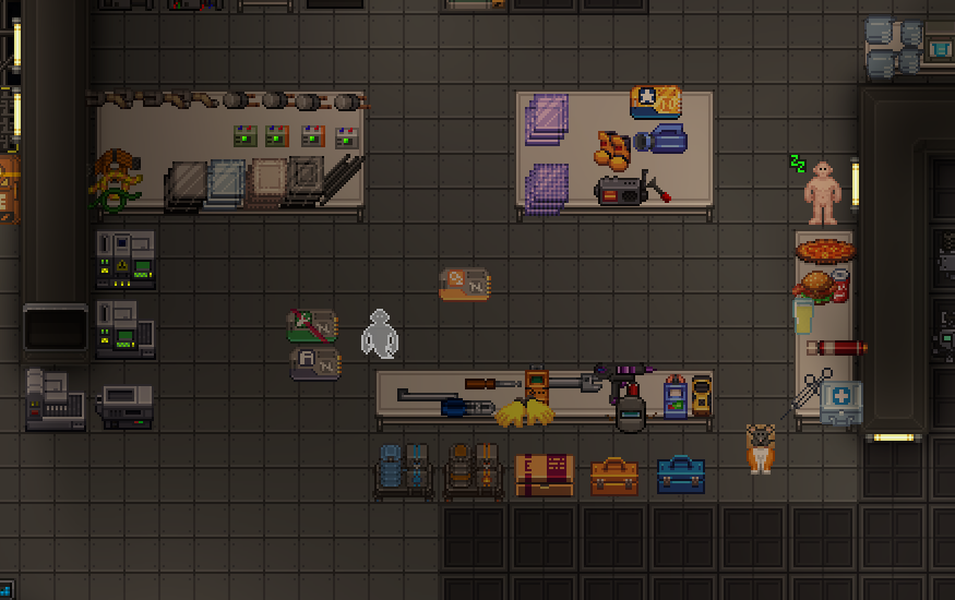
This is funky station, partially post resprite. The new custom sprites range from okay to undesirable. The greatest issue here is mostly in the poor color choice: most colors are too saturated, the wirecutters look very strange and the dark parts strain the eyes while most of the tools are overshaded. Some of the material reflections are too exaggerated.
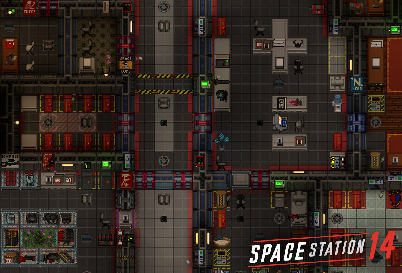
The wizden resprite has okay walls (though the segmentation is unfortunate) while the windows look like strange walls and the airlocks communicate that they are a door quite badly. I believe it to be an inferior implementation of shiptest sprites to hullrot’s, though that could just be force of habit on my part.
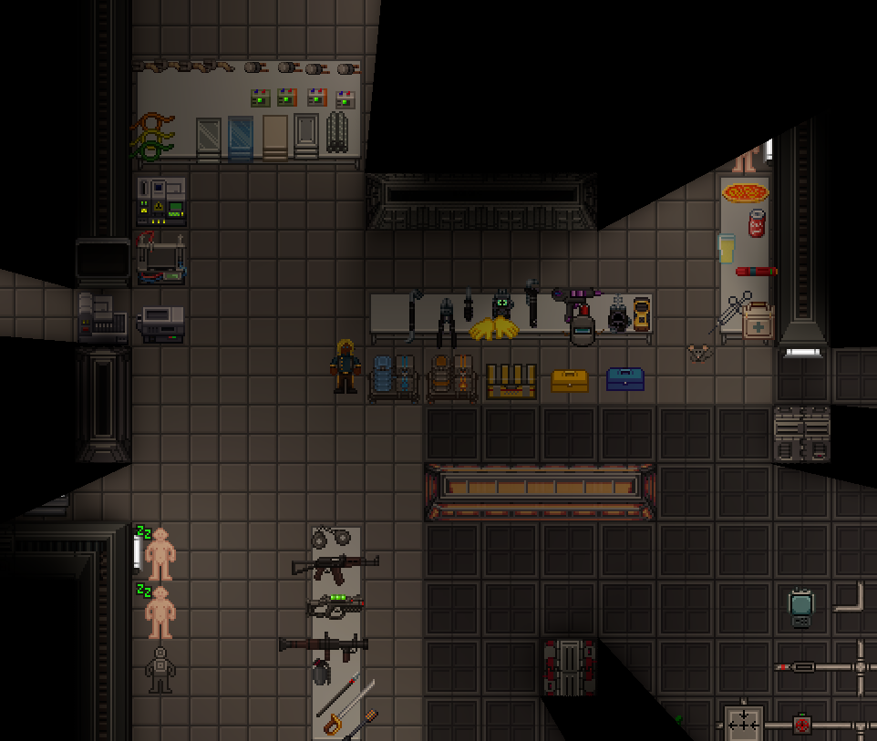
This is hullrot, in its latest revision before death. The wall sprites are within the goldilocks zone of detail and clarity. The airlocks are adequately communicated, the tools are inexcusably bad and the window sprites are so-so (the same problem as the wizden resprite, probably inherited from shiptest, where windows = strange walls), but the clarity of the fork is somewhat maintained and balanced out by the presence of simpler base game sprites.
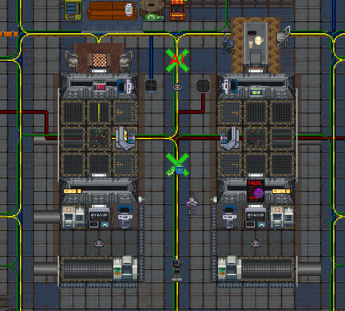
Hullrot has managed to create a decent looking artstyle even as it retains many sprites from varied forks. What helps is that a lot of the useable machinery retains brighter, basegame derived sprites while the tiles, walls and decor are comparably more sedate, subtly drawing the player’s attention to them.
But this is all really vague!
Well that’s because that’s how it works. I (the author) do not have the skill to create an artbook or all of this art by myself nor do I have a small team at my disposal to create perfectly aligned art. We will rely on a lot of volunteer work. This is just the basic “do not do X” document, a lot of what you’ll be doing will just be looking at the game at hand and trying to make things fit.
Factional design languages
Cloud civilian
Industrial, fairly clean. Since these are cloudmen, some luxury and visual refinement can be afforded - but not too much. Departmental colors overlaid on a relatively monochrome base.
Orbital civilian
Generous coatings of space dust. Grey interiors, colors only in crucial areas. Worn and used equipment. Damage present in various areas.
Cloud royal
Smooth, decorated interiors. Somewhat brighter than civilians but not by much. Blue as the color base (take care not to oversaturate).
Orbital syndicate
Dark and red, de facto continuing the original game’s syndicate art style. Panels hide away crucial machinery, everything is more streamlined and militarised.
Cloud vox
Worn down and grimy aesthetic. Orange as the primary color with a warm tint to most things. Distinctly different looking from human environments.
Current sprite requests
Most of our efforts will be directed at the creation of walls, tiles, windows and other commonly seen items. Finished sprites will be ticked off.
The large amount of sprites is desired for the creation of distinct environments that the player will be able to distinguish at a glance.
Right now we require the creation of these sprites:
Walls
Walls will be listed by faction and by intended type. (which should help with making the sprite) As a rule of thumb, cloudman civillian sprites can be used as orbital civillian sprites when dirtied and lightened.
Cloud civ
- simple solid wall
- simple shuttle wall
- medium wall (de-facto reinforced wall)
Orbital civ
- simple solid wall
- simple shuttle wall
- medium wall
Orbital syndicate
- simple solid wall
- simple shuttle wall
- medium wall
- heavy shuttle wall
- heavy wall
- peltier wall (inspiration)
- radar absorbent wall (inspiration)
Cloud royal
- simple solid wall
- simple shuttle wall
- medium wall
- heavy shuttle wall
- heavy wall
- peltier wall
- radar absorbent wall
Cloud vox
- simple solid wall
- simple shuttle wall
- medium wall
- heavy shuttle wall
- heavy wall
- peltier wall
- radar absorbent wall
Windows
Cloud civ
- simple window
- shuttle window (more submarine like)
- medium window
Orbital civ
- simple window
- shuttle window (more submarine like)
- medium window
Orbital syndicate
All syndicate windows should be red.
- simple window
- shuttle window (more submarine like)
- medium window
- heavy shuttle window
- heavy window
Cloud royal
- simple window
- shuttle window (more submarine like)
- medium window
- heavy shuttle window
- heavy window
- decorative window
Cloud vox
All cloud vox windows should be orange.
- simple window
- shuttle window (more submarine like)
- medium window
- heavy shuttle window
- heavy window
- decorative window
Tiles
Please make 4 tiles per every sprite sheet for variantisation.
Cloud civ
- light steel tile (clean, slightly grimy, very grimy, damaged)
- base steel tile (clean, slightly grimy, very grimy, damaged)
- dark steel tile (clean, slightly grimy, very grimy, damaged)
- techmaint tile (slightly grimy, very grimy, damaged)
- techmaint tile 2 (slightly grimy, very grimy, damaged)
Orbital civ
Orbital civ tiles should in general be lighter colored than their cloudman counterparts. Grime here should not be dark, but light as it comes from space dust.
- light steel tile (clean, slightly grimy, very grimy, damaged)
- base steel tile (clean, slightly grimy, very grimy, damaged)
- dark steel tile (clean, slightly grimy, very grimy, damaged)
- techmaint tile (slightly grimy, very grimy, damaged)
- techmaint tile 2 (slightly grimy, very grimy, damaged)
Orbital syndicate
- light steel tile (clean, slightly grimy, very grimy, damaged)
- base steel tile (clean, slightly grimy, very grimy, damaged)
- dark steel tile (clean, slightly grimy, very grimy, damaged)
- techmaint tile (clean, slightly grimy, very grimy, damaged)
- techmaint tile 2 (clean, slightly grimy, very grimy, damaged)
Cloud royal
- light steel tile (clean, slightly grimy, very grimy, damaged)
- base steel tile (clean, slightly grimy, very grimy, damaged)
- dark steel tile (clean, slightly grimy, very grimy, damaged)
- techmaint tile (clean, slightly grimy, very grimy, damaged)
- techmaint tile 2 (clean, slightly grimy, very grimy, damaged)
- decorative tile (clean, slightly grimy, very grimy, damaged)
Art